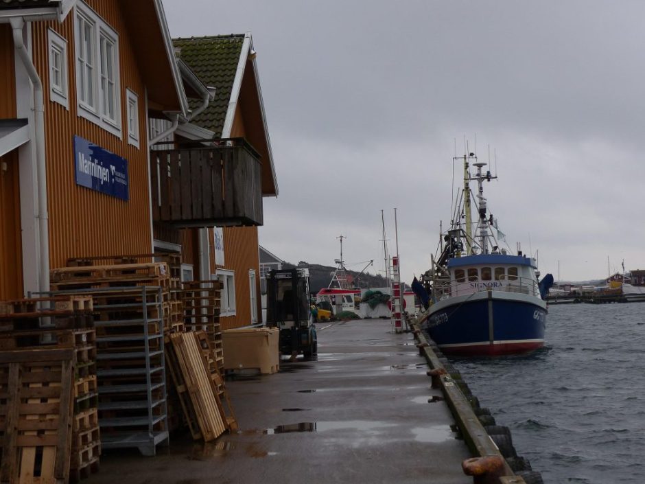
Went for an evening walk down by the harbor yesterday. The 8800 came in to land their catches, I stopped and watched for a while. Enjoyed being Grebbestadsbo; What a privilege to experience this. The scent of sea and shrimp trawlers, and the sight of lucid fishermen men who been out long battle with boat, winds and water. Mmm ….
As a car drove up and parked, a dark blue van with Very large letters on the page. It was the first time I saw this car.
I read pretty fast. I understand symbols pretty fast. I think most people do it.
My brain registered letters like this, before I had time to think about:
"Mr Hafs and the water authority" it looked like a joke. A van who claimed to belong to a small theatre company which toured with a children's show about a slovenly uncle's arduous adventures with or against an authority.
Out stepped two kepsförsedda people. It locked itself in my brain. Was this Hidden camera? But out stepped two dyed-in-the-wool officials, obviously out on the mission to control fishing boats ' landing.
The brain was surprised back in its reasoning. Read a second time.
The car's letters were these:
I could not believe my eyes. Thought it must be an unusually stupid/uneducated/young person a smudge where the letters on your car. For it was so amazingly unbelievably wrong. Felfel! It must surely be a hyphen after "Sea". And the water authority is a Word, it may not be later! And does not have a capital letter! You can not write that! It is WRONG, it looks STUPID!
Of course saw thus myndighetskepsarna also entitled idiotic. Not their fault, but that is what happens when you are forced to drive around in a car that trumpeting IDIOCY.
I had to Google this strange mystery of linguistic authority. And Yes, marine and water was aware of this dilemma, but patiently explained to us fools on their website:
"No hyphens?
Sea logo consists of a ordbild, in a fastidious letter form with a small detail that stands out and makes it unique. Logo to signal stability and seriousness and it should be easy to understand that we are a government agency.
When to write marine and water in text using, of course, the hyphen and the small v at the water authority. But the logo is called ordbild, where the designer created a picture of the Agency's name and then taken the artistic freedom. "
Yes, but thank you! Where we have the explanation: there is no text, but a "ordbild" and the designer has taken an "artistic freedom"! Which (should) signal the "stability and seriousness"!
HM. I do not think the designer has succeeded. It looks like text. My brain registers it as text in the first place, not as an artistically designed logo. In my world seems the whole authority suddenly extremely unserious because of its decision to say yes to this logo. Don't really know if that is the case. Maybe you should ask a prawn fishermen?


Lämna ett svar